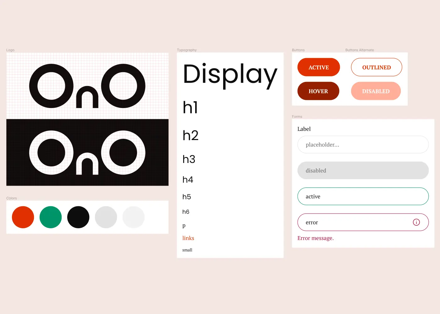
Styleguide
The overall branding is designed to portray being outdoors. The round nature provides a softer feel and similarity with the roundness of the product/logo.
- Logo - the name of the product designed to look like the product
- Colors - orange (sun), green (grass), black (shade)
- Typography - Poppins for a round style for headings similar to the logo; PT Serif for easy to read body text
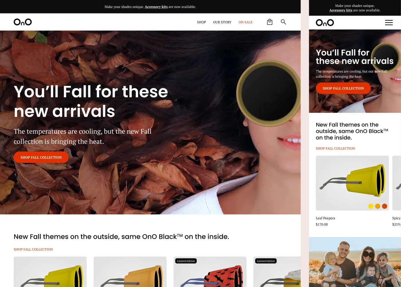
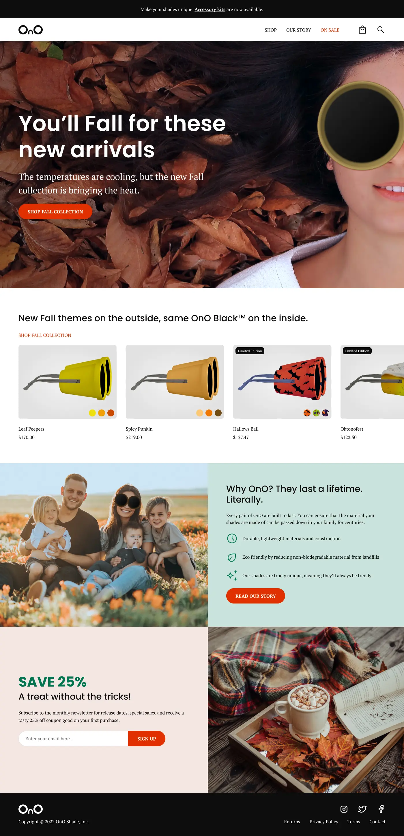
Responsive Landing Page
The landing page introduces the Fall collection with clear CTA markers for customer action. The page ends with empathetic reasons OnO is a good company and a special offer to drive home reasons to buy.
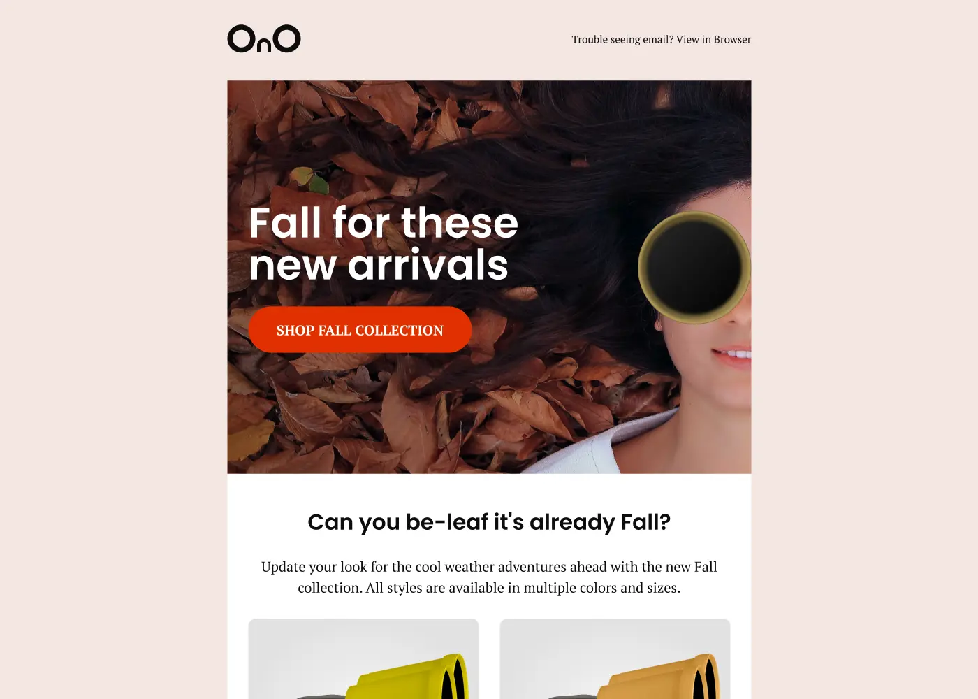
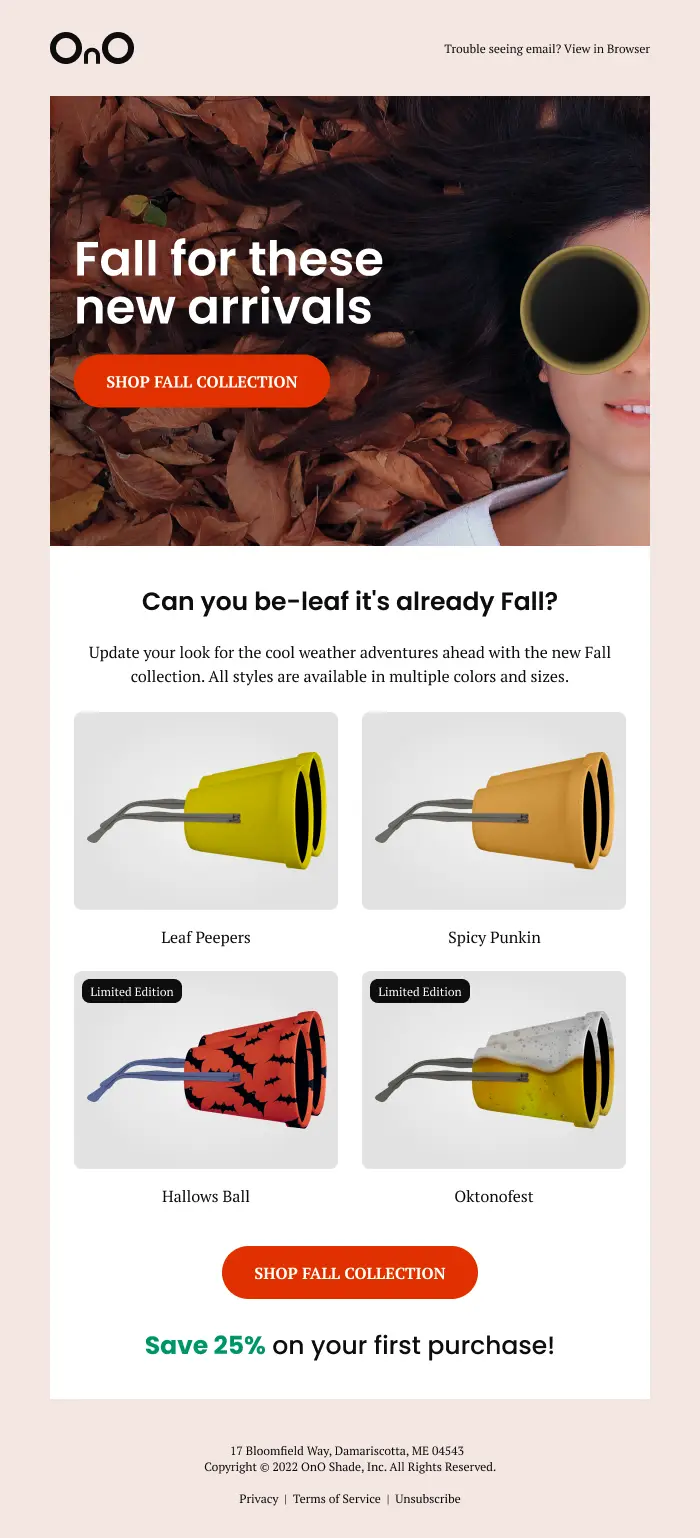
Promotional Email
A lighthearted email with consistent imagery and messaging as the landing page. CTA buttons are placed top and bottom due to scrolling with a special offer to entice a purchase.
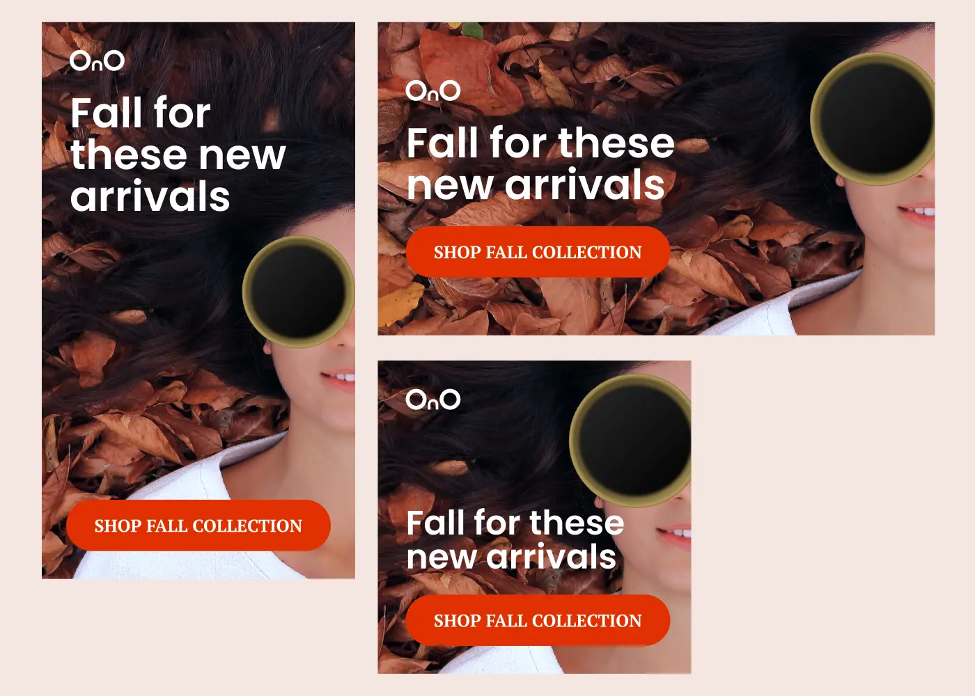
Social Media Ads
General sized social media banner ads that lead users to the landing page. The design and messaging is consistent with the landing page and other marketing materials.